Today we are excited to introduce a new “Bold and Juicy Look” for Points in Case that includes an updated logo and a safe but marginally un-PC color palette refresh from black and white to ebony and ivory. You may have noticed it already on your mobile device, laptop, Amazon Fire Tablet, or child’s Covid-issued “learn-from-home” Chromebook if you live in a made-up neighborhood.
We’ve seen the power comedy can have when people give laughter a chance, especially in precedented times like these, when there is so much to moan and complain about in the world; when people unhinge their zombie retinas from the deep dive standup comedy specials they added to their Netflix queue in moments of weakness, and instead turn to the arduous but surprisingly fulfilling task of reading or writing short humor on the web.
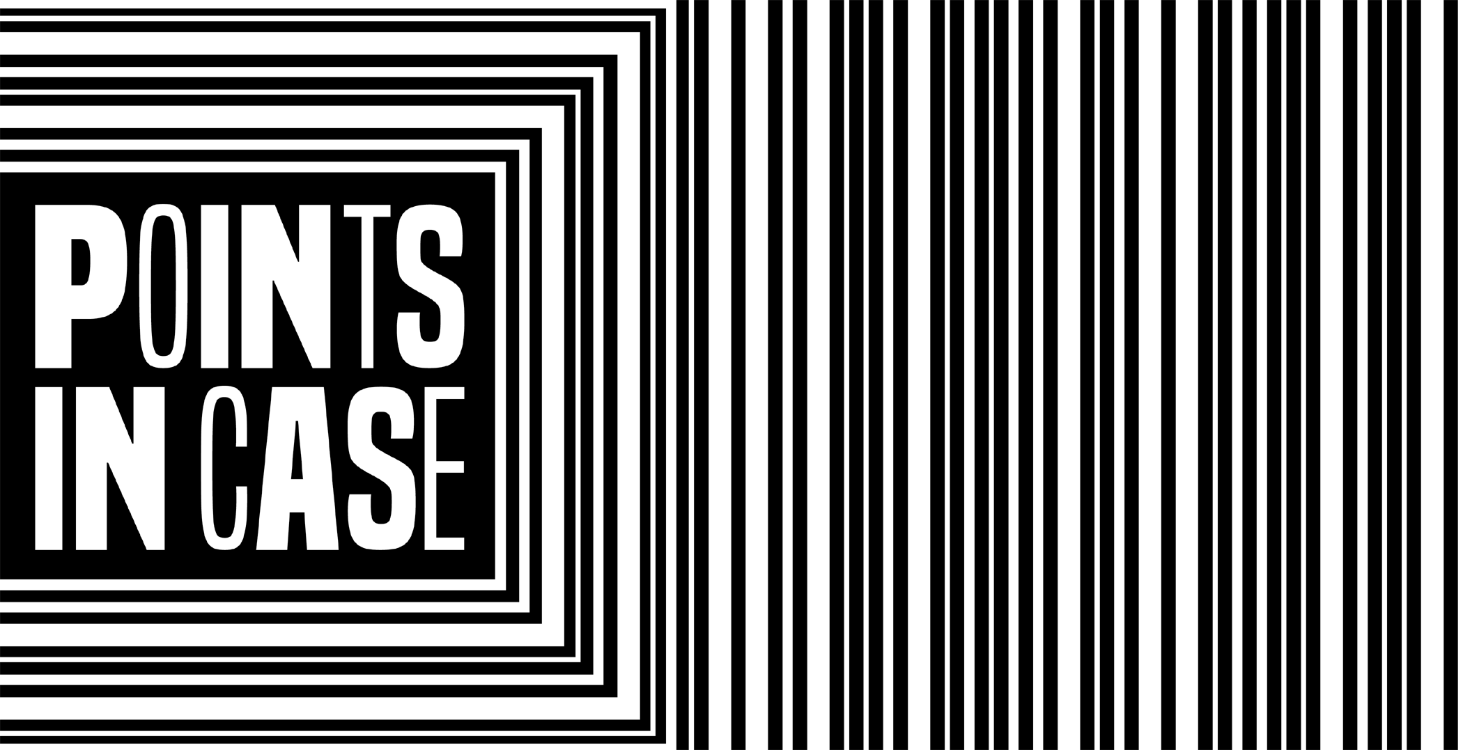
It’s this type of defiance in the face of palatable and “it was pretty good, did you see it?” options that inspired us to create an all-caps, sans-serif, in-your-face logo that proudly declares, “OUR LETTERS DON’T HAVE TO BE THE SAME WIDTH!” (Imagine those letters aren’t the same width either, please.) It’s what moved us to then ask the logo if its letters should be grouped by their widths, to which the logo offendedly exclaimed, “ALL LETTERS WERE CREATED EQUAL!” and “ARE YOU TRYING TO TEAR US APART?” Points taken.
The logo then stood up and began screaming something about not putting it in a box, so we decided that occasionally we would put it in a box just to show it who’s in charge, and that honestly, sometimes people need boundaries to excel.
![]()
It was not happy about this, started crying and wouldn’t shut up (typical infant logo), so we turned off the lights and finally it went to sleep.
![]()
Anyway, a laugh is a universal gesture of community, respect, dying, and awkward tension best represented by acronyms like HAHA, LOL, ROFL, and WTF. That is not why we chose “PIC” as our nickname, but it is a fun coincidence, if you’re into that sorta thing. (Me, I’ve never really been into coincidences; what’s the point of horoscopes if there’s a bunch of random, unforeseen stuff happening in the world?) So we also made a new version with nine of the letters squished together so small you can’t see them, but there’s really no significance there, so stop asking us why the new logo is all caps, the written version is title case, and the acronym always has an uppercase “i”—the logo is a Virgo, okay?
![]()
Every laugh is unique, and they build and grow. One laugh leads to another, and another, and they build and recede in intensity, which is reflected in the ripple effect of the logo. Because remember, you can’t actually hear a laugh on the liternet, you can only look around desperately for likes or claps or shares to remind you how effective the laugh track was in Seinfeld. In lieu of our brand identity agency’s idea for “smacks,” we’ve simply updated the logo on every page, to remind you that yes, everyone is laughing.
If there’s anything we’ve learned in our 20 years of PIC, it’s that literary comedy is built on small, simple actions—basically, a new logo every time there’s about to be a new president. If we’re wrong, consider this an unfortunate coincidence (am I still using that word correctly?). Otherwise, keep giving laughter a chance, and we’ll change our clothes for you again in 2024 (this is all written in the horoscopes, btw).
Big thanks to Lucy Andersen for the logo design and being all-around awesome to work with! Follow her on IG @lucy.andersen
More Humor

If Sci-Fi Was Written by People with the Same Amount of Scientific Knowledge as Romantasy Writers Have About Sex

Anxiety Dreams Experienced by People with Healthy Childhoods